Project Description
The mission of the Energy Department is to ensure America’s security and prosperity by addressing its energy, environmental and nuclear challenges through transformative science and technology solutions.
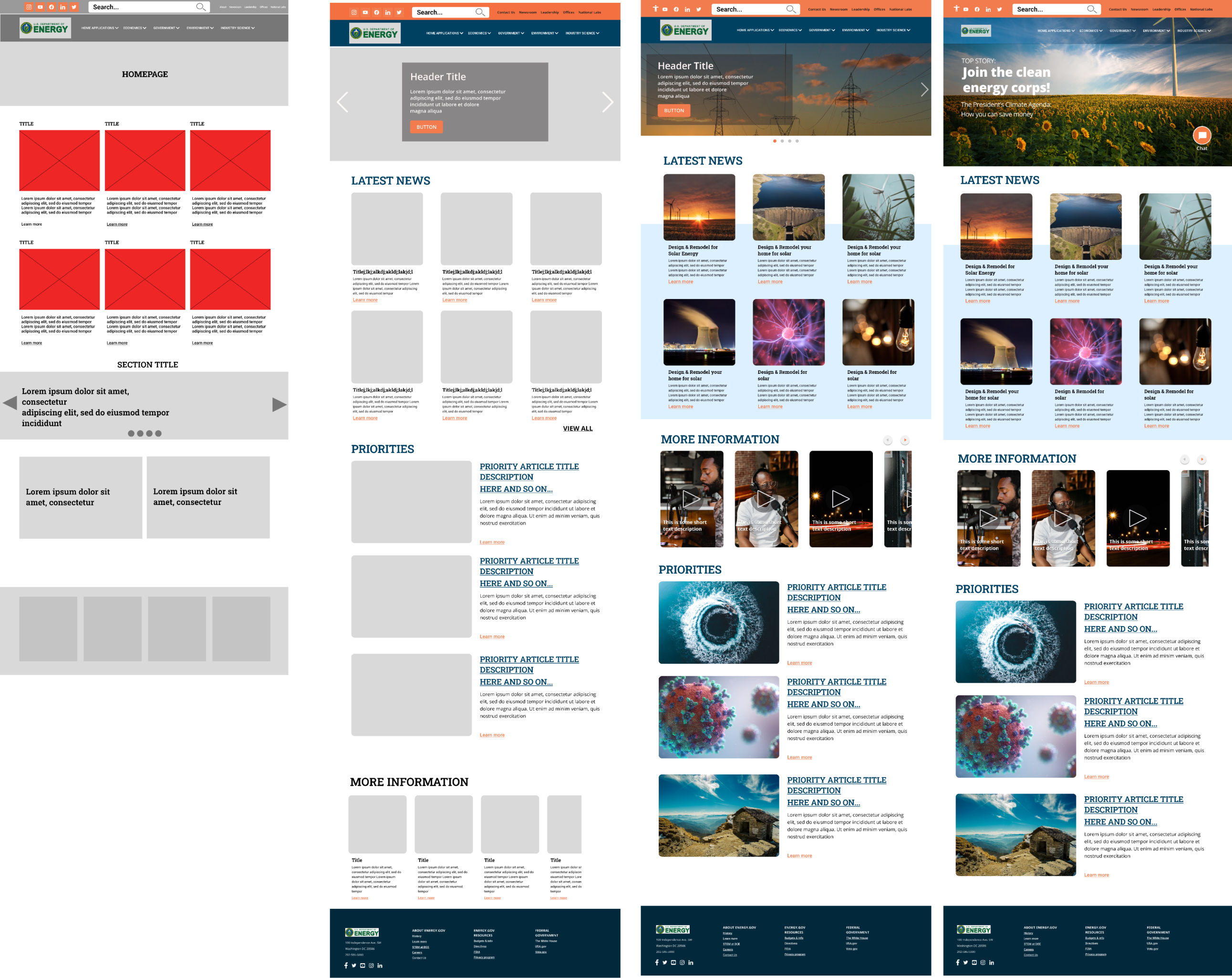
Problem
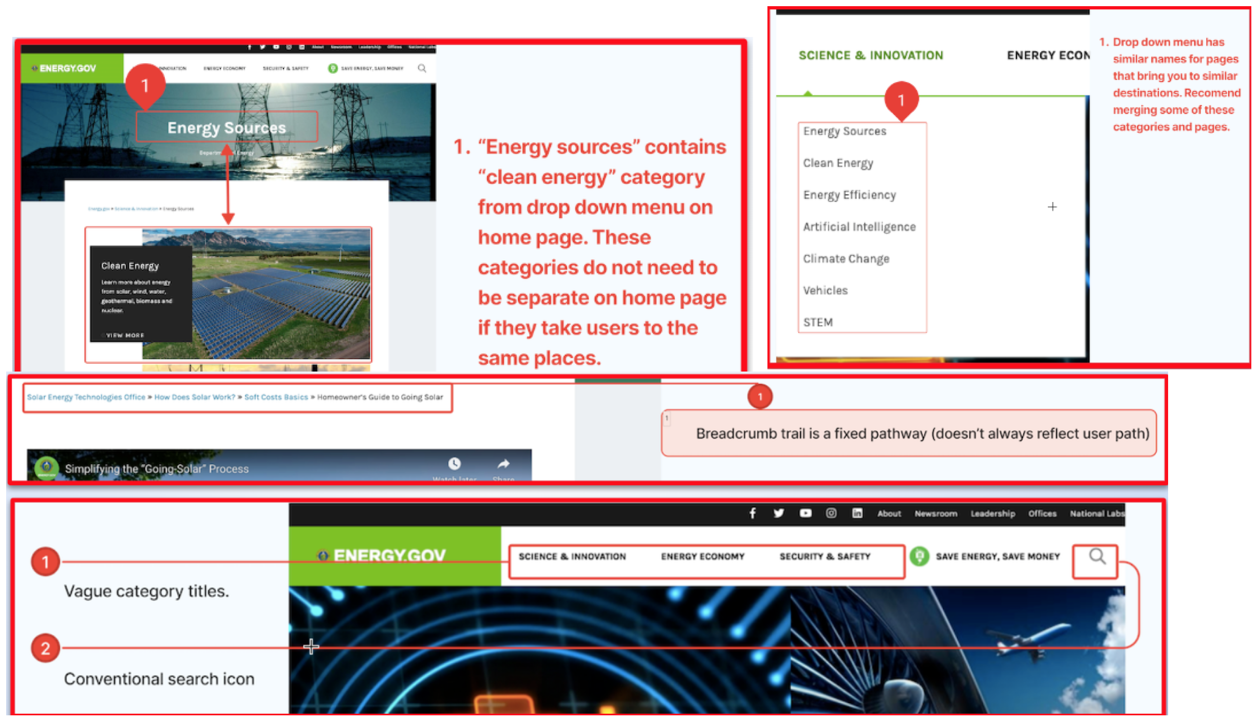
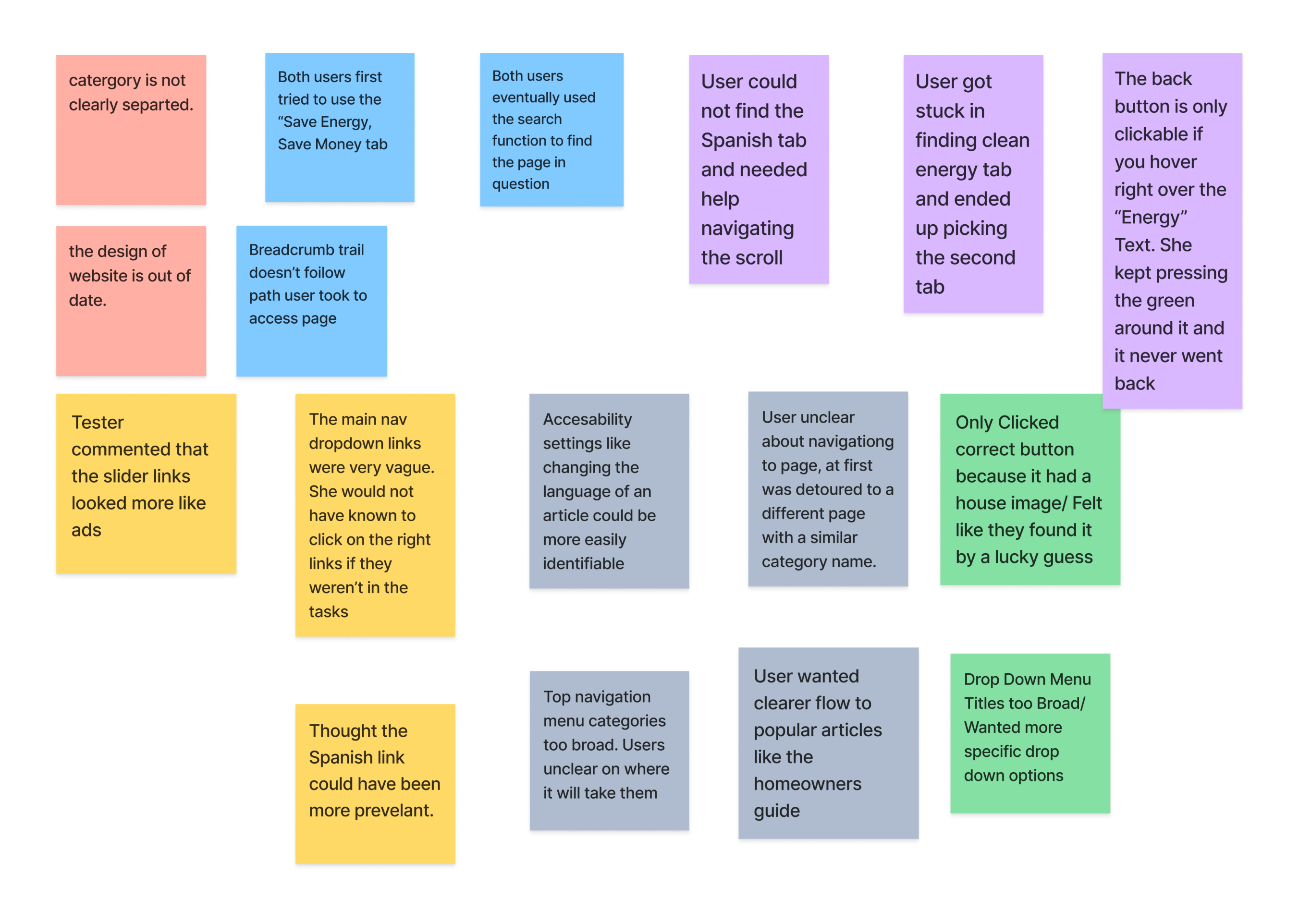
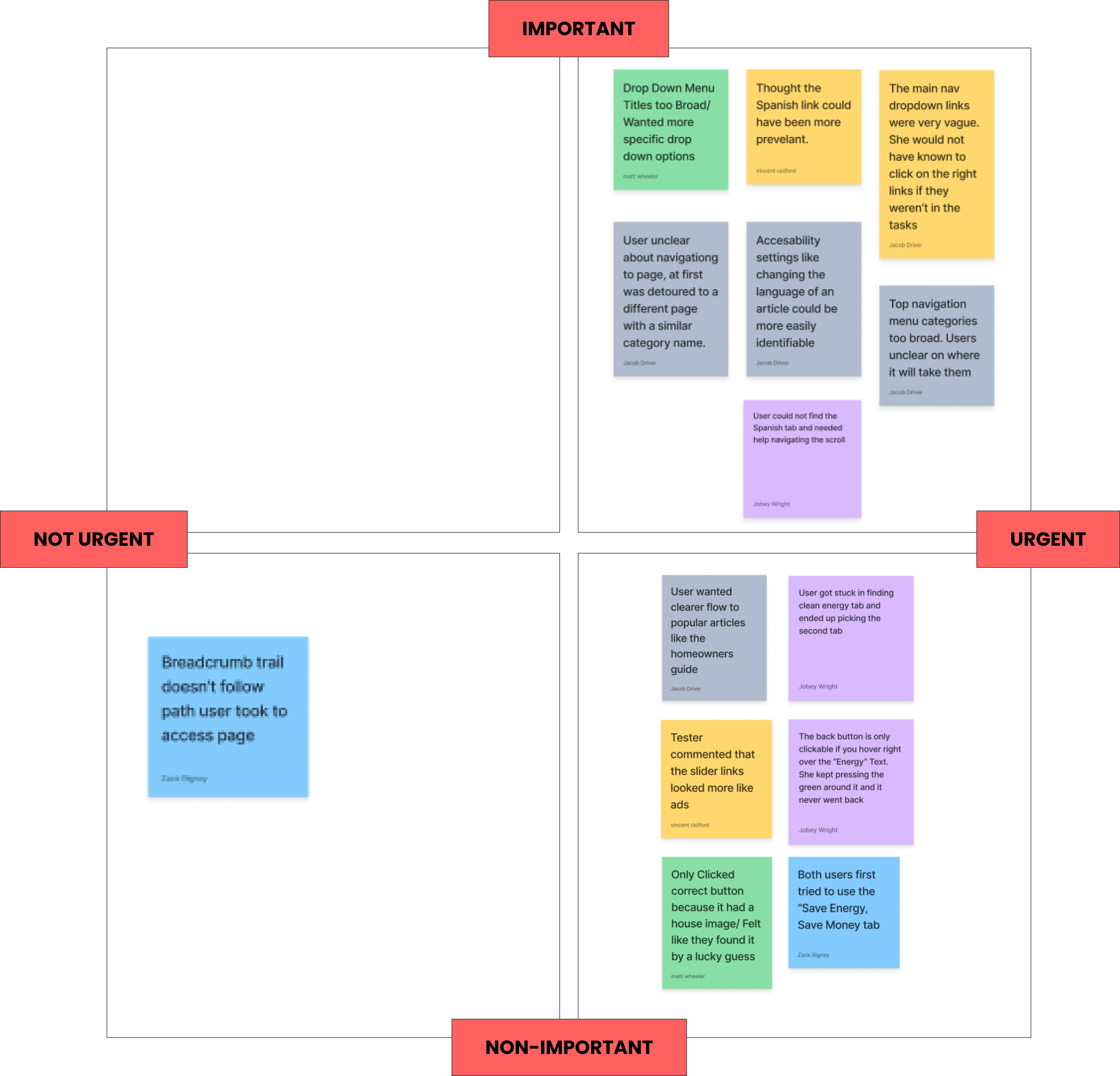
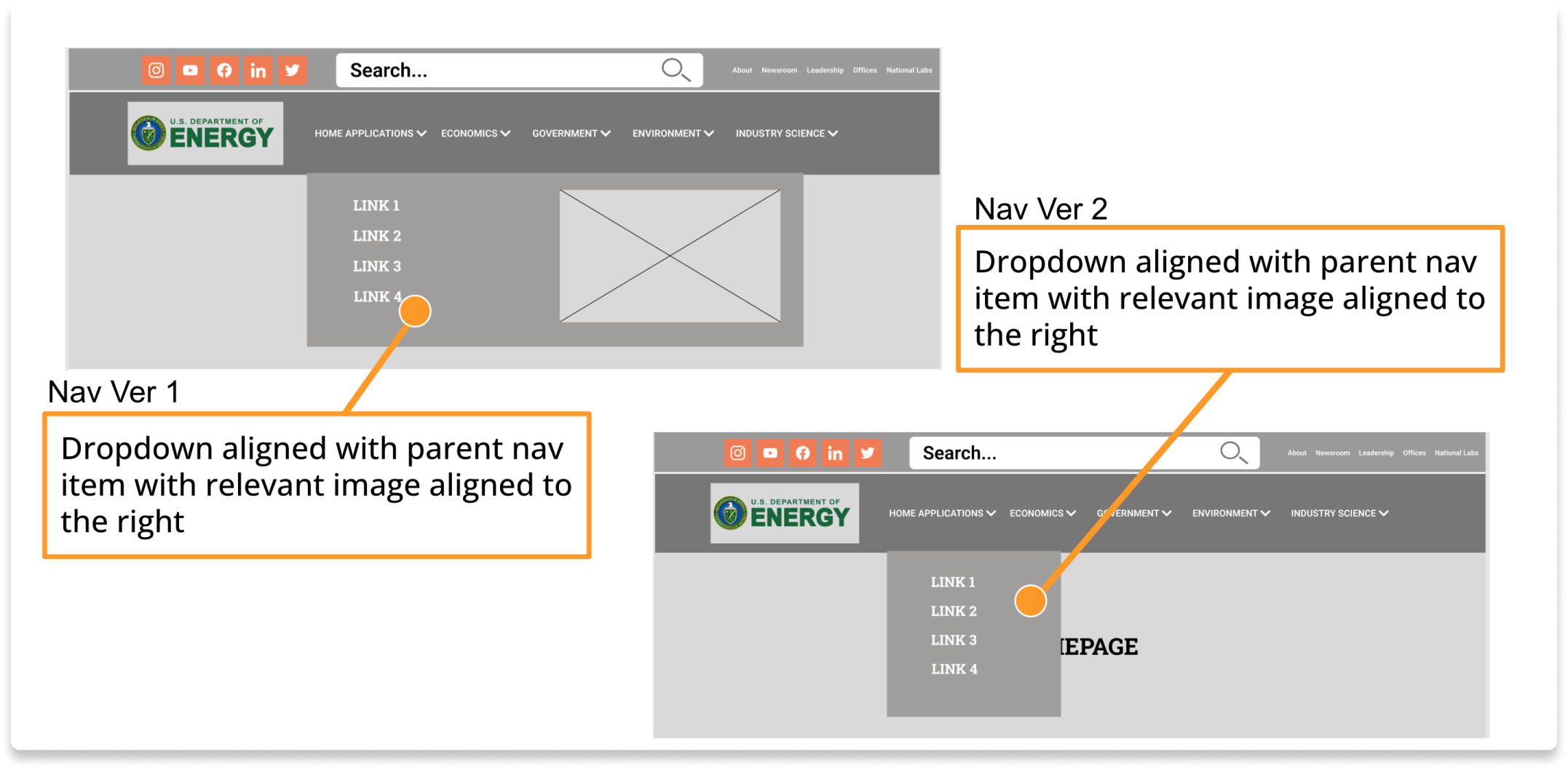
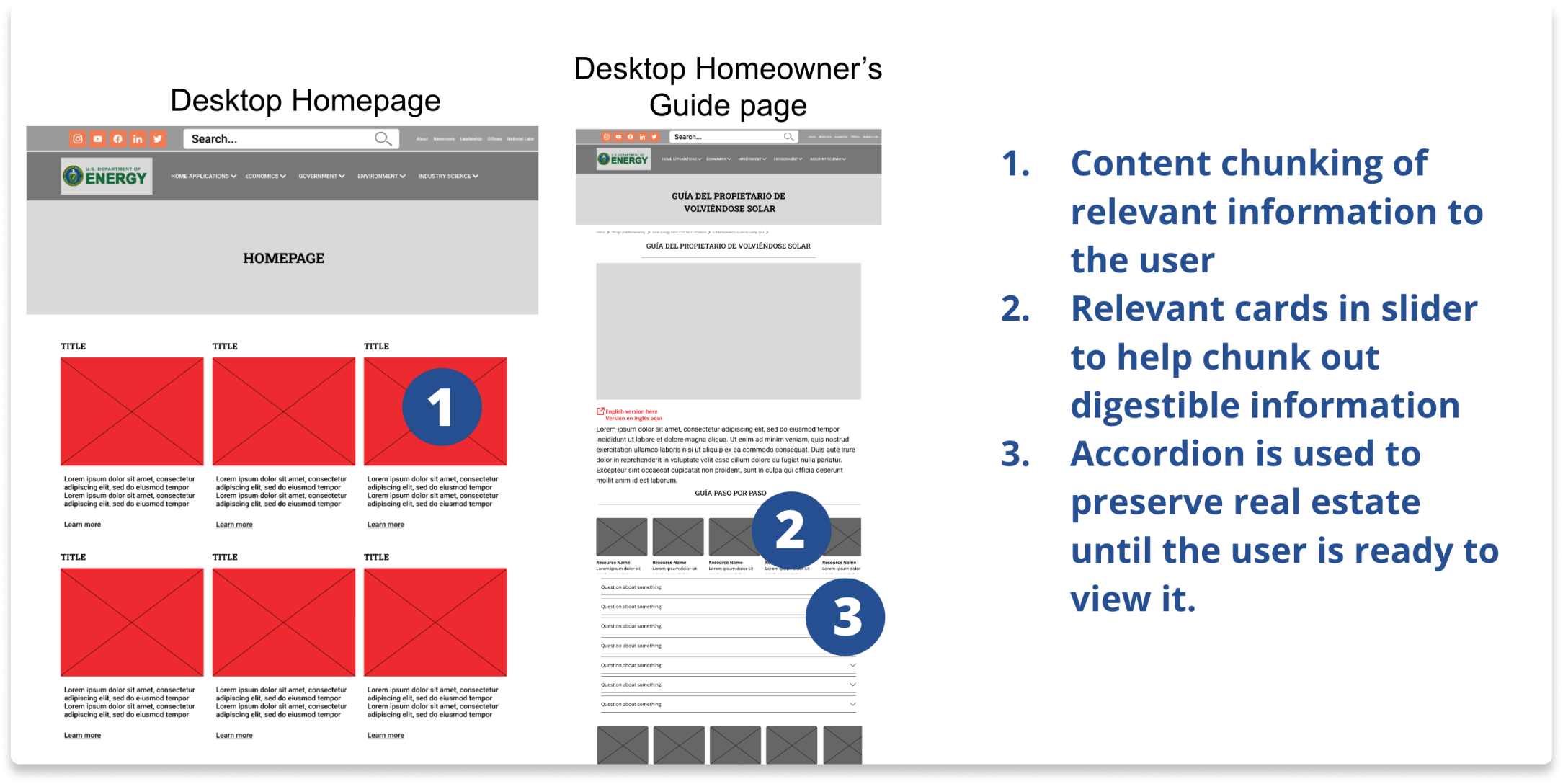
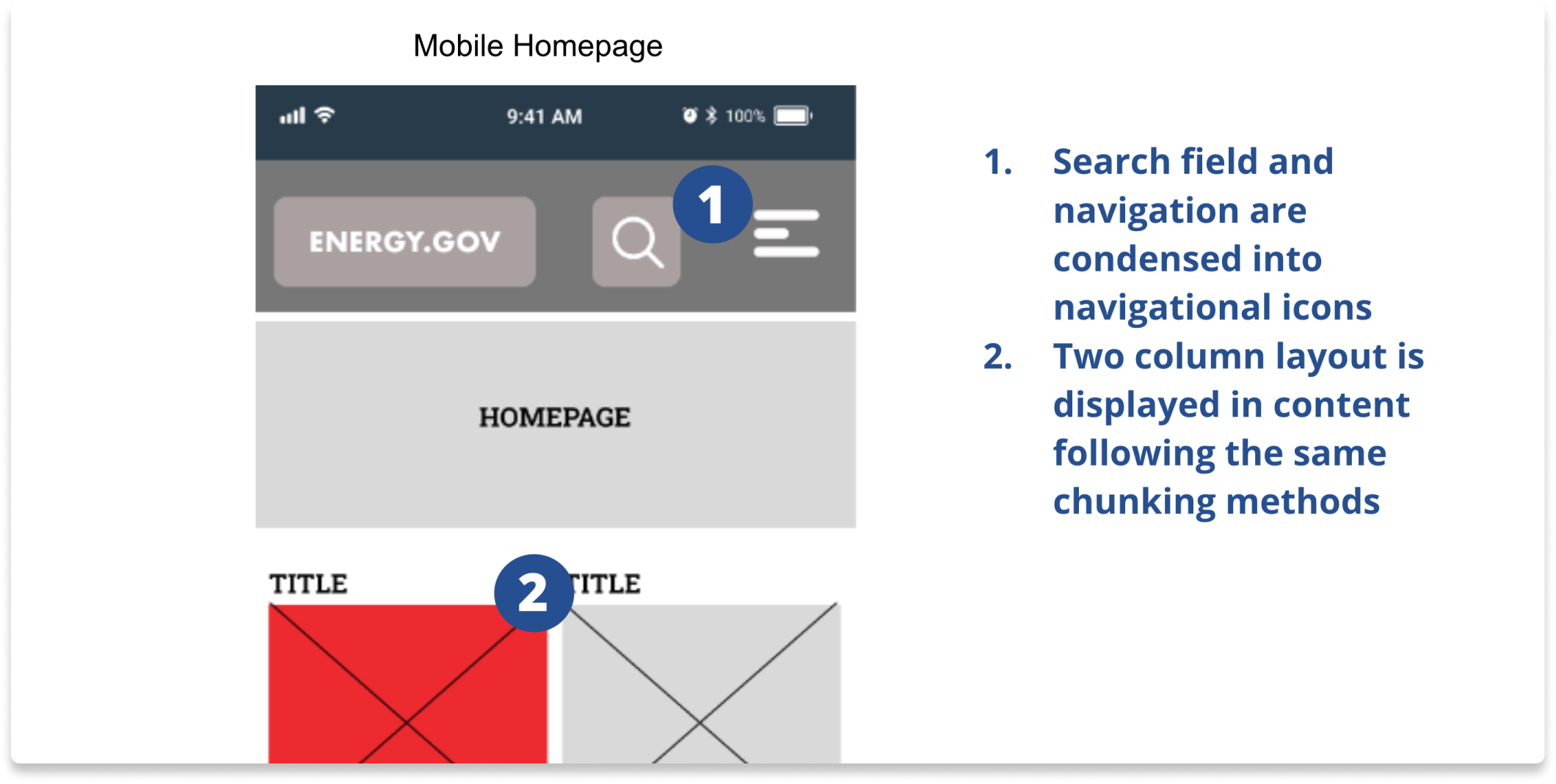
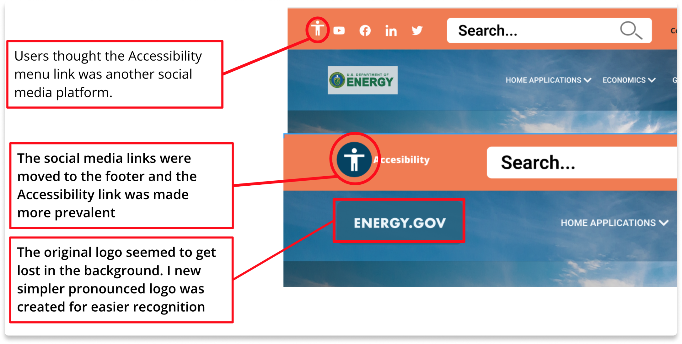
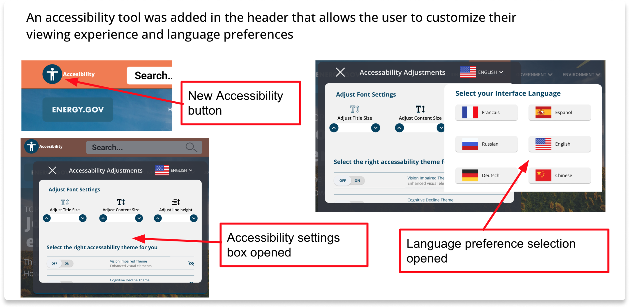
The site’s current design has vague Information Architecture that makes navigating their site challenging and the lack of an accessibility option further detracts from the user’s experience.
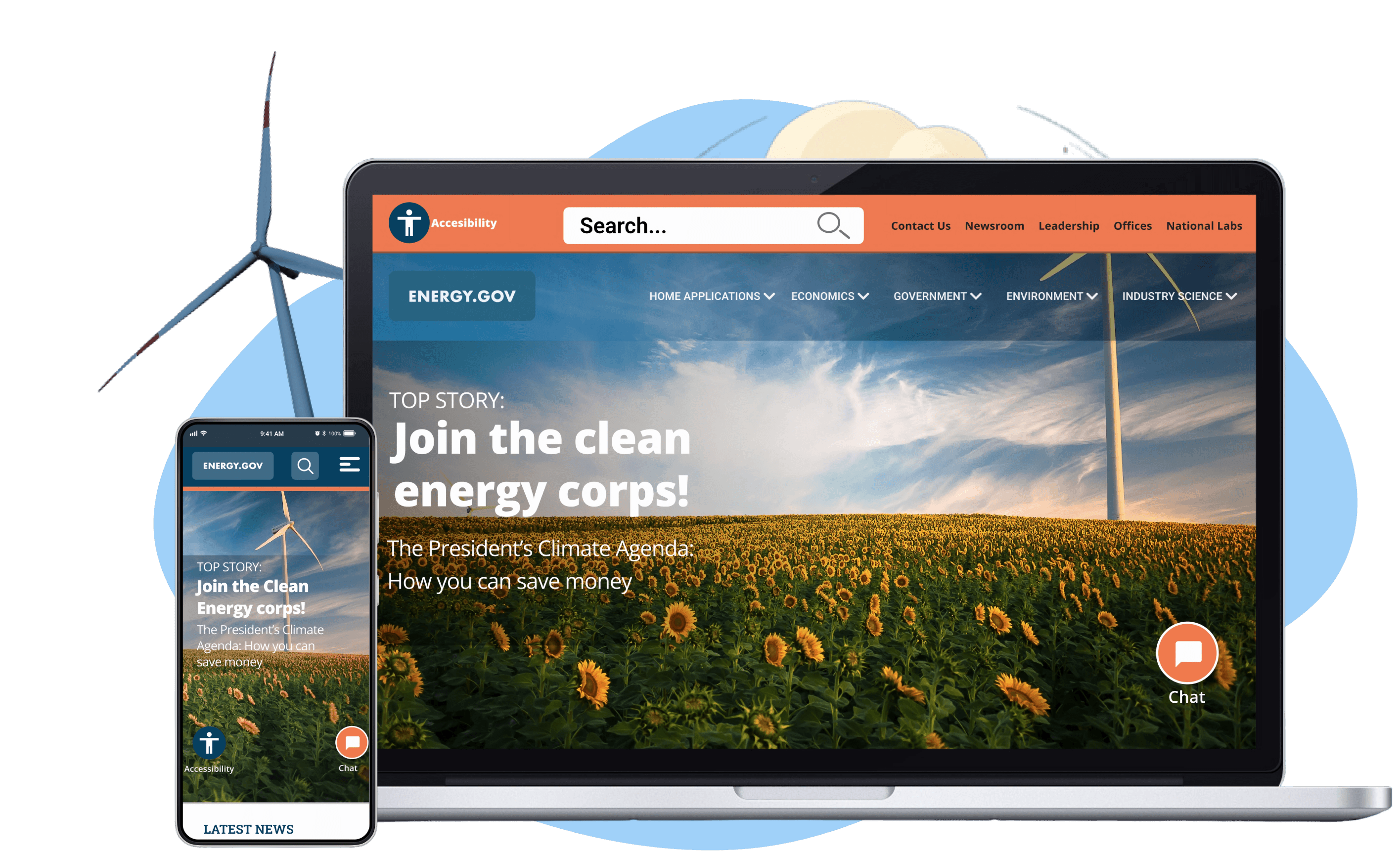
Solution
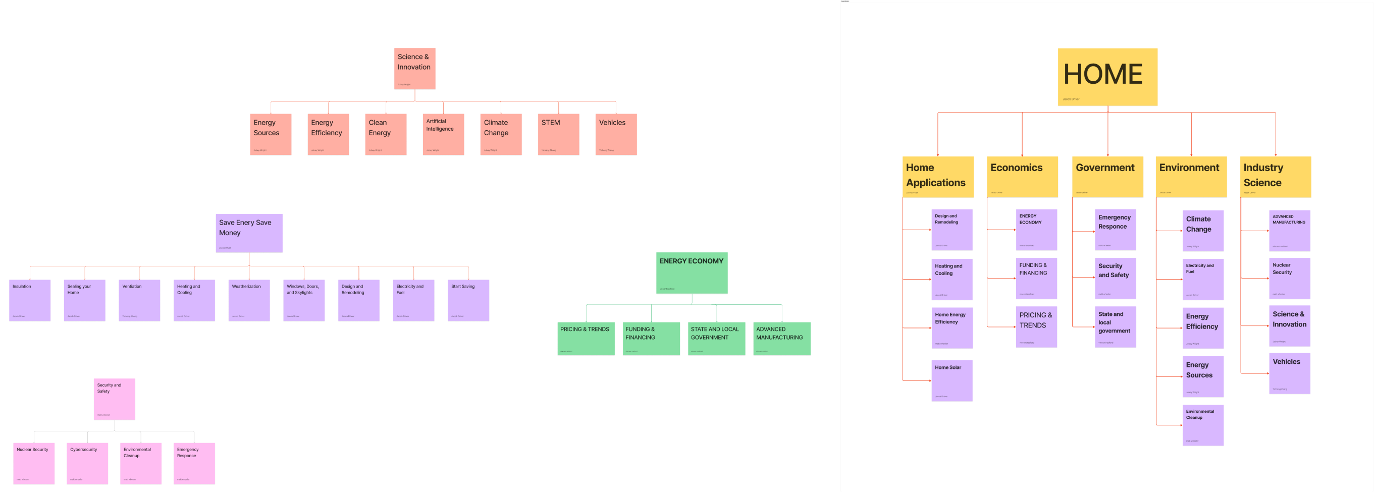
Our goal was to improve this site’s Information Architecture as well as provide a more comprehensive accessibility option for both desktop and mobile platforms.
My Role
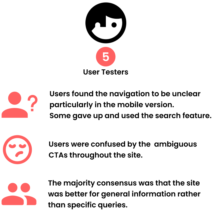
Information Architecture, User Research, Heuristic Analysis, Interaction Design, Prototyping, User Testing
Team
- Jacob Driver
- Vincent Radford
- Matt Wheeler
- Jobey Wright
- Yicheng Zhang
Tools Used
- Figma
- Mirro
- Adobe CC
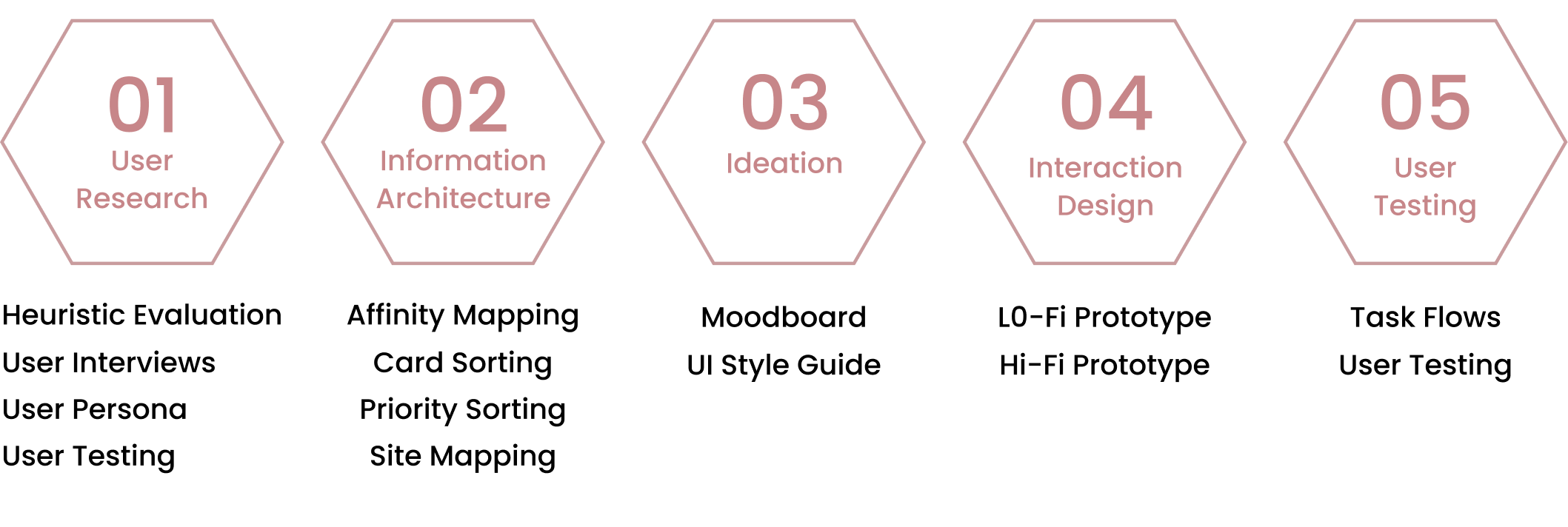
Research Methods